In this Article
A landing page can transform your creator business.
It can turn casual readers, viewers, or listeners into committed subscribers, fans, and customers. But how can you design a landing page that resonates and converts?
It comes down to implementing five core design elements—visuals, headlines, copy, colors, and a CTA—and using them to make your offer irresistible to your ideal subscriber.
Ready to design a massively successful landing page? Let’s dive in.
A quick overview: what is a landing page?
A landing page is a dedicated page you use to turn a visitor into a lead by offering a resource in exchange for their email address.
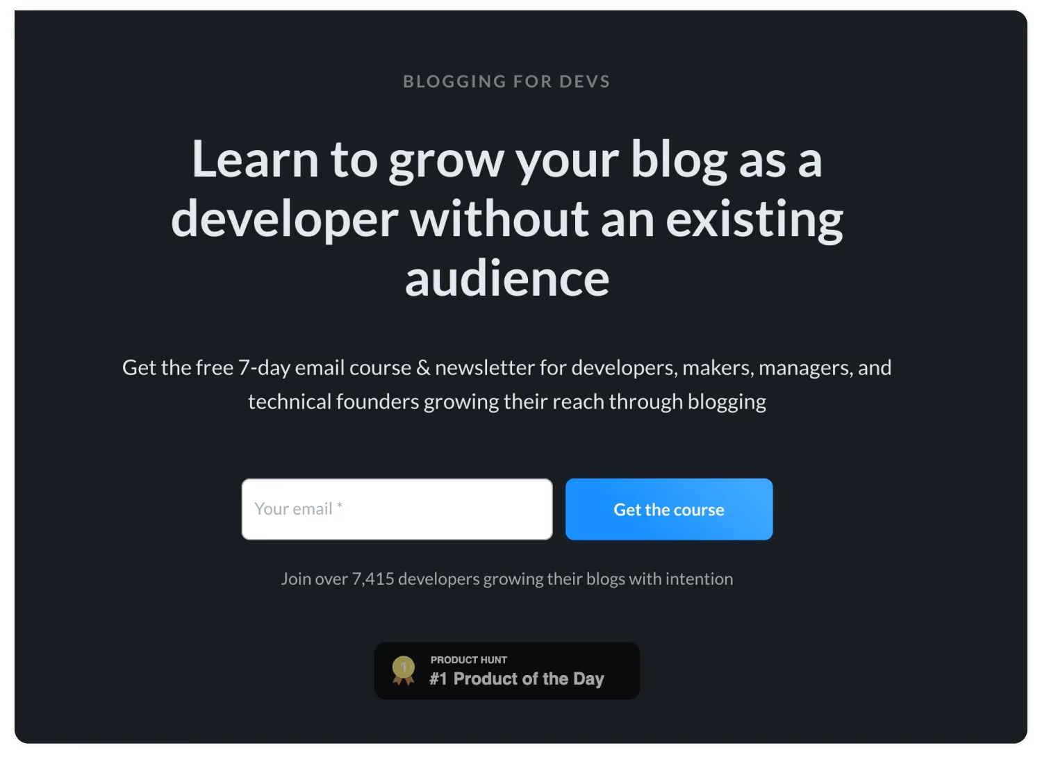
Landing page for a free email course and a newsletter for developers who want to write online. Image via Blogging for Devs.
That resource is called a lead magnet, and it can be anything your audience finds useful—a value-packed newsletter, an ebook, a webinar, or a discount they can use in the future.
All landing pages have one thing in common: they aim to get the visitor to follow through on a specific call to action (CTA).
That’s what makes landing pages a powerful, focused marketing asset.
4 ways a landing page benefits you
A landing page can take your creator business to the next level.
With well-designed landing pages, you can build an audience that will look forward to your name in their inbox every time, both when you’re sending a regular newsletter and launching a product.
Here’s how a landing page does exactly that:
- It generates warm leads for your business. The more specific your lead magnet is—for example, 10-minute productivity hacks for busy parents vs. a generic ‘how to be productive’ guide—the more your visitors will resonate with it.
- It segments your audience. When you offer different lead magnets for different audience interests, you can later send personalized emails to different subscribers. For example, your busy parent’s audience can have interests like productivity, cooking, home organization.
- Validate new product ideas. Have a product idea but not sure if your audience wants it? Instead of building the entire product and launching it, use a landing page to feel your audience’s pulse on that topic. If many of them sign up to hear more, you’ll know you’ve found something.
- Deepen your connection with subscribers. Connect your landing page to a dedicated thank you page and a welcome email sequence. This lets new subscribers get to know you, learn from you, and reply to your emails with their questions and experiences.
Why your landing page design matters
You know the way entering a store or a restaurant for the first time makes you feel? It only takes you seconds to learn whether you like being there or not.
It’s the result of how the noises, scents, colors, and shapes come together and make an impression on you.
Design is the equivalent of those elements when it comes to your landing page. A landing page that looks cluttered, disorganized, outdated, illegible, or unprofessional is likely to deter a visitor, regardless of the copy on the page.
A review of three studies revealed it only takes 50 milliseconds—that’s 0.05 seconds!—for visitors to form a first impression of a website. They (quite literally) decide if they want to stick around in the blink of an eye.
You might have just one chance to make that first impression a positive one, which also means you need to make sure your landing page looks good on any device.
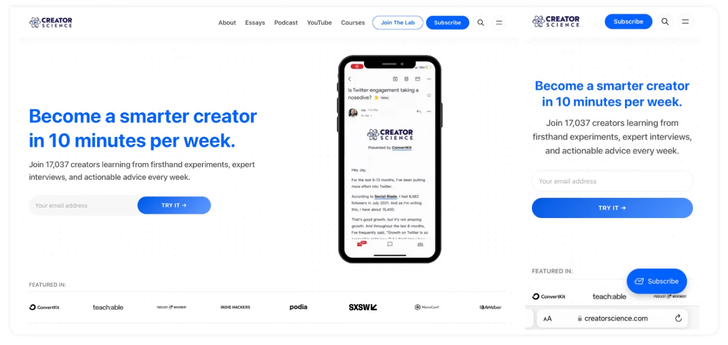
Make sure your landing page design looks good on desktop and mobile devices. Image via Creator Science.
Define a goal for your landing page
Before you set foot in a landing page builder, you should determine what you want to achieve with that specific landing page and think about the landing page metrics you need to measure to see if your design achieves results.
Here are some examples of landing page goals:
- Sign up for a weekly newsletter
- Download a set of templates
- Register for a webinar
- Access a free resource library
The point of a landing page goal is to keep the page itself focused. This goal guides a visitor to take one distinct action. For example, Justin Moore’s newsletter landing page used to promote many different things, like a list of brand deal platforms, weekly sponsorship opportunities, and pitching tips.
“There was too much going on. A lot of conflicting call-to-actions. A testimonial, a downloadable lead magnet, the newsletter content, another testimonial. I think people were getting overwhelmed,” Justin explained. When he flipped the switch and set just one goal for his landing page—to get people to sign up to weekly, hyper-curated sponsorship opportunities—his subscriber growth exploded.
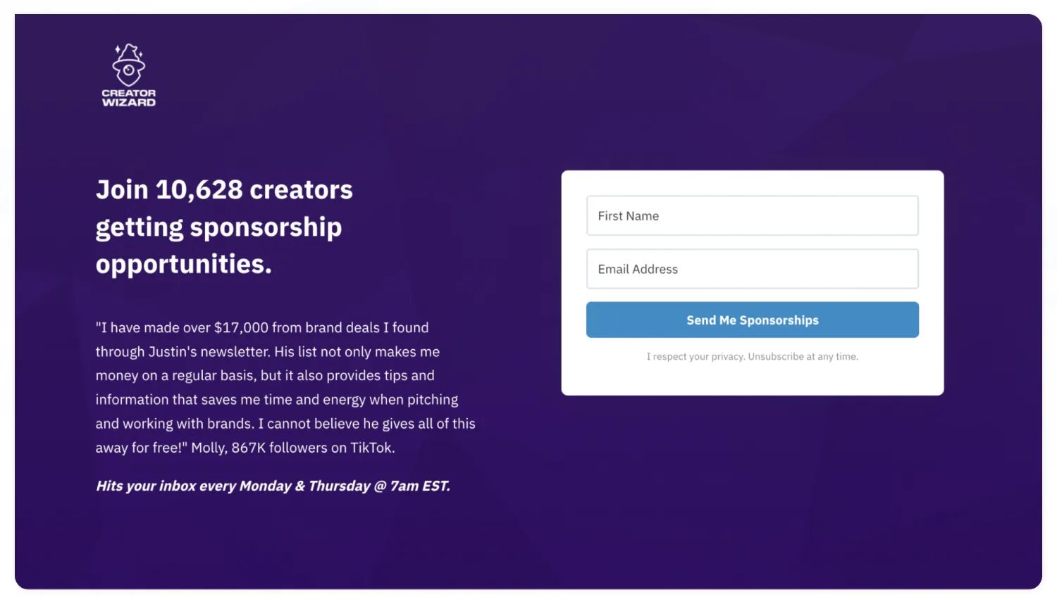
The main landing page for Creator Wizard’s curated sponsorship opportunities. Image via Creator Wizard.
5 core design elements that make a landing page convert
Let’s jump into the elements that work together to make your landing page design successful:
- Visuals
- Headlines
- Copy
- Colors
- Call to action (CTA)
1. Visuals that grab attention and resonate
First, consider the design elements that most easily direct your visitors’ attention: images. This can be photos, illustrations, screenshots, custom designs, or some combination of those.
Why images on your landing page matter
Our brains process images much faster than text— research says as much as 60,000 times faster—images on your landing page can give your visitor that instant “I’m in the right place” feeling.
Just think about this: if you saw a generic ‘Apple’ label, you’d see it very differently if there was a picture of apples in a basket next to it versus a photo of a sleek smartphone.
Here are three questions you can use to pick the right visuals:
Question 1: Who are you trying to reach with your landing page?
Use visuals to help your visitor see themself—in their current state, their desired state, or both. Let’s say you offer coaching and tips for adults with ADHD. If someone only knows your focus is helping ADHD, and before they read any copy, an image can help them see your landing page was made for them.
How? By showcasing adults with ADHD who are struggling to achieve what they want instead of, say, a parent helping a child that has ADHD.

Use images that show subscribers your offer is for them—this example compares parents of children with ADHD versus adults with ADHD. Images via Shutterstock.
Question 2: What do you want your landing page visitor to focus on?
One of the most powerful ways you can use images—and especially photography—is by having them point to the most important headline, message, or part of your landing page.
A great way to do this is by featuring a photo of yourself looking in the direction you want your potential subscriber to look towards.

Where you look towards in your landing page photo tells your visitor what they should look at. Images via Customer Camp and Alex Beadon.
Question 3: How will an image support what you want to say?
Remember that travel agencies don’t sell travel arrangements—they sell a sense of adventure and freedom. Luxury car companies don’t sell a vehicle that takes you from point A to point B—they sell a lifestyle.
Keep this in mind when choosing your landing page imagery. How can you showcase the journey they’re about to take, the result they want, or the challenge they’re dealing with?
2. Headlines that summarize what your lead magnet promises
Your landing page headline is likely the first thing a visitor will read after landing on your page. It might be the only thing they’ll read. Use it to convey the core of what’s on the other end of signing up.
Use a tool like Headline Analyzer to write a headline that’s clear, skimmable, and powerful.
3. Copy that makes your visitor feel understood
Your landing page copy does several things at once:
- Identifies and names the problem or challenge your visitor has
- Shows you understand the pain points that stem from the problem
- Offers a solution that is realistic and doable
- Paints a picture of the desired outcome
It does so in two main ways. There’s a chance you’ve already heard of the benefits versus features debate when it comes to copywriting—let’s cover the importance of both in your landing page copy.
First: good copy outlines the benefits and the solution
When your copy focuses on benefits, it means you’re showing your landing page visitors how subscribing will make their life or work easier, better, or more enjoyable. It helps them picture a life after implementing the solution you’re offering.
To showcase benefits of your offer, aim your copy at the feelings that come with having a specific problem and the improvements someone will experience after they take action on your landing page.
Second: good copy defines essential features
More often than not, only talking about the benefits isn’t enough. “Get a full nights’ sleep” or “Launch a successful podcast” are excellent outcomes, but they tell the visitor nothing about how they’ll get there. That’s why it’s important to mention features.
For your landing page and your lead magnet, the ‘how’ is usually the format in which you’ll give your subscriber the path to an outcome. Some examples include email lessons, video guides, downloadable PDFs, prompts, and curated links.
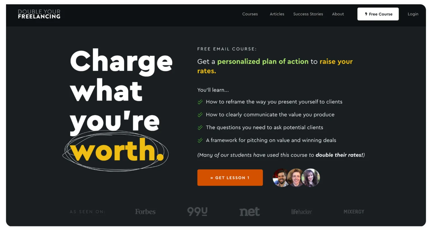
The Double Your Freelancing free course merges benefits (double your rates) with features (personalized plan of action, numbered lessons). Image via Double Your Freelancing.
4. The right colors
Pay attention to the colors you’re choosing for your landing page design. Think about the page background, colors dominant on your image(s), button colors (more on that in a minute), and any accents on your page.
How might the colors you choose make your visitor feel? For example, blue is said to invoke a sense of calm and reliability, orange is playful and friendly, while white conveys simplicity and minimalism. Check out color theory if you want to get more intentional with your landing page colors.
Another point to keep in mind is the color palette you already use on your website and social media. If you’re using those assets to send people to your landing page, the colors on the landing page should align with where they landed from. This will make it feel familiar and trustworthy.
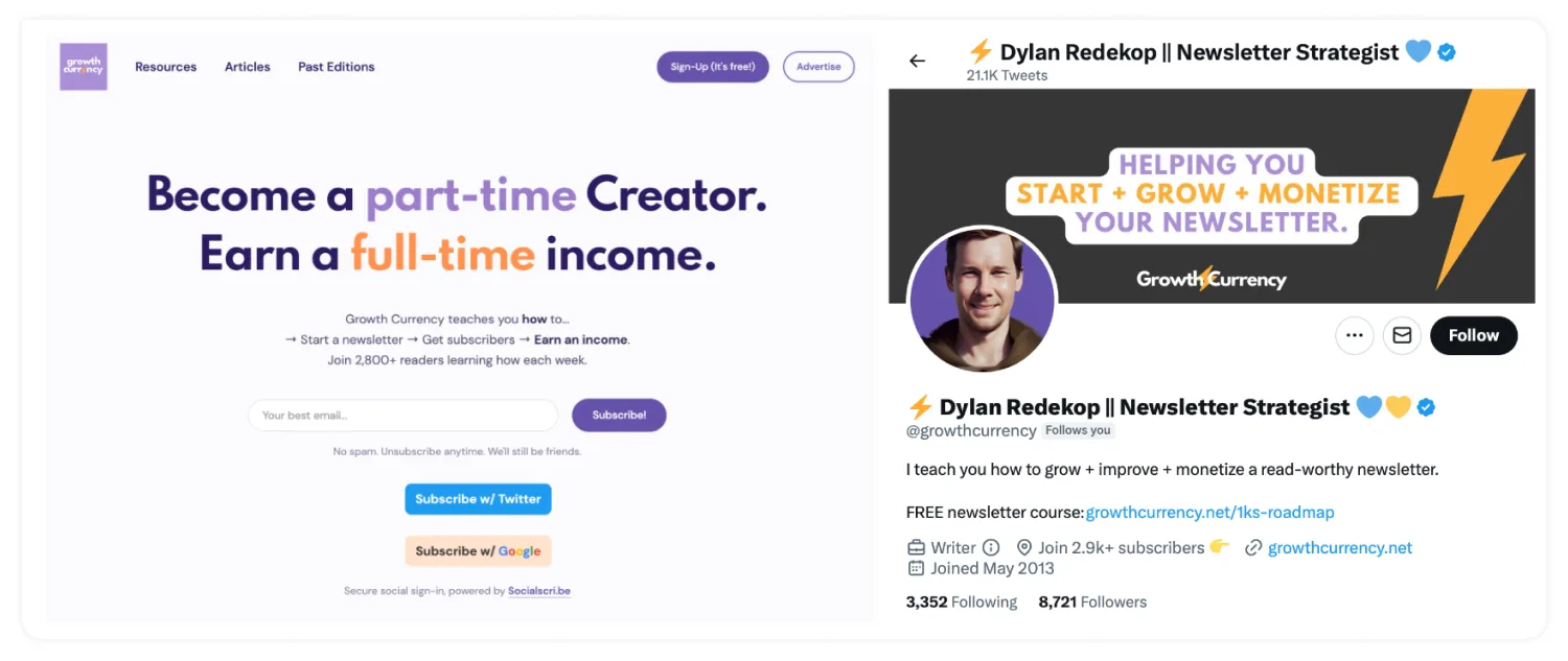
The matching color palette between the Growth Currency X/Twitter profile and website. Image via Growth Currency.
5. A powerful call to action (CTA)
Your CTA is the final step to encourage your visitors to take action. To make it effective, consider two key parts of your CTA: its color and its copy.
Your CTA color, just like your landing page color, can invoke certain feelings for your visitors. It also needs to ensure your CTA stands out from the rest of your landing page—if someone can’t find it easily, you might lose them before they take any action.
When it comes to your CTA copy, there’s nothing inherently wrong about having a standard ‘Subscribe’ button. Many great landing page examples have it. Based on the tone of voice you use in your writing, it’s worth experimenting with different versions of your CTA copy. Some call to action examples you can consider include:
- Subscribe to the show
- Send it my way
- Send me updates
- Get a free ebook
- Get instant access
10 ways to make your landing page design more effective
You have the basic building blocks for your landing page. How can you make it hit and surpass your goals?
1. Make sure your landing page design is responsive
Almost 60% of all online traffic comes from mobile devices, so make sure you’re not missing a chance to impress visitors who land on your page from a tablet or a smartphone.
The essentials that make your landing page powerful—its main message and CTA—should be easy to digest and click on even on the smallest of screens.
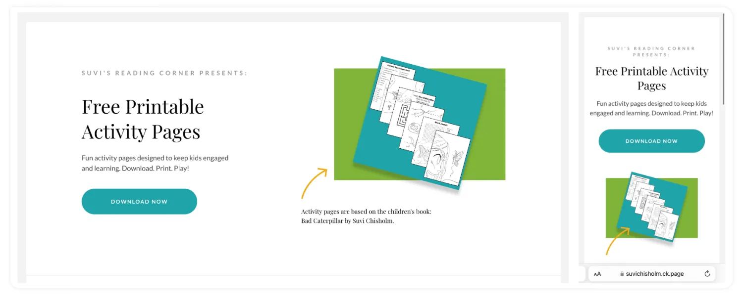
A mobile-responsive landing page. Image via Suvi Chisholm.
2. Add social proof
People want to see that what you offer will work for them. The best way to do that is by showing them that other people, those just like them, have loved what they’ve learned, achieved, or solved after subscribing.
And with 72% of consumers believing that testimonials by consumers are more credible than the claims a brand is making, social proof is the way to go.
Anything positive your subscribers have shared works here, from public tweets to direct comments you’ve heard from subscribers.
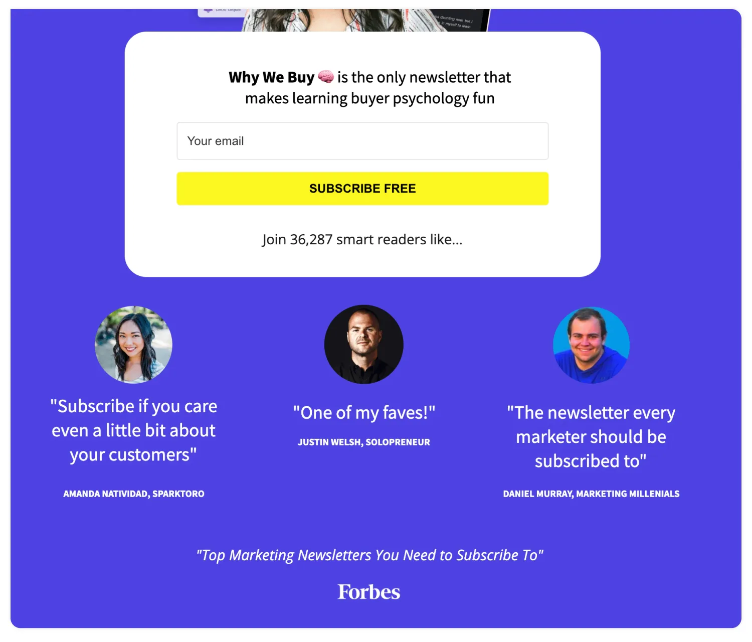
Social proof in the form of the number of subscribers, subscriber reviews, and a press feature. Image via Customer Camp.
3. Minimize distractions
You might feel tempted to promote multiple things on your landing page. Your TikTok and YouTube. Your paid products. Your other landing page.
But this only creates distractions and a risk that your visitor will click away before subscribing—which could mean they won’t come back.
Remove any unnecessary menus, navigation bars, and links to keep your visitor’s focus on filling out the form and completing the CTA.
4. Drive social shares
The moment someone decides to sign up, they’re at peak excitement about your offer. Lean into that excitement and encourage them to share your landing page on social media.
If you want to make sure you don’t distract your visitor before they sign up, you can encourage social sharing after signing up, as part of your thank you page.
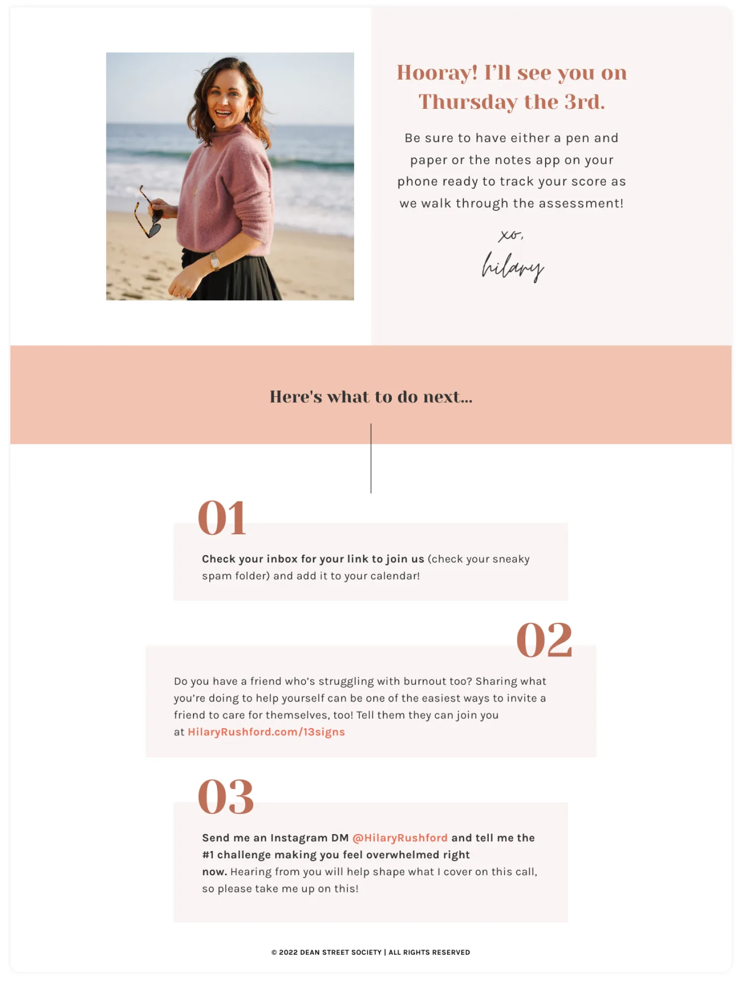
Hilary Rushford’s call for sharing her free workshop landing page (under point #2). Image via Dean Street Society.
5. Make sure your page loads fast
The faster your landing page loads, the better—some experts recommend keeping your page load time in the 1-2 seconds range.
To check how well your landing page does when it comes to page load time, and explore ways to improve it, check out PageSpeed Insights.
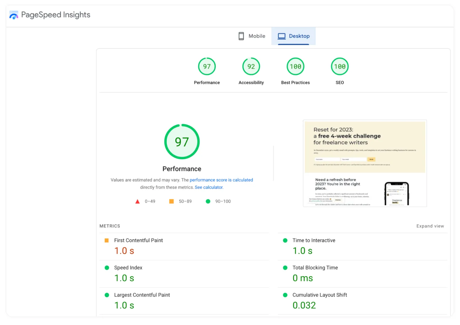
Report for page load time on desktop. Image via PageSpeed Insights.
6. Use countdown timers to build scarcity
Is your landing page leading up to a fixed time in the future, like a launch or a live workshop?
Add a countdown timer to it to emphasize that the time is running out and nudge your visitors to take action before it’s too late.
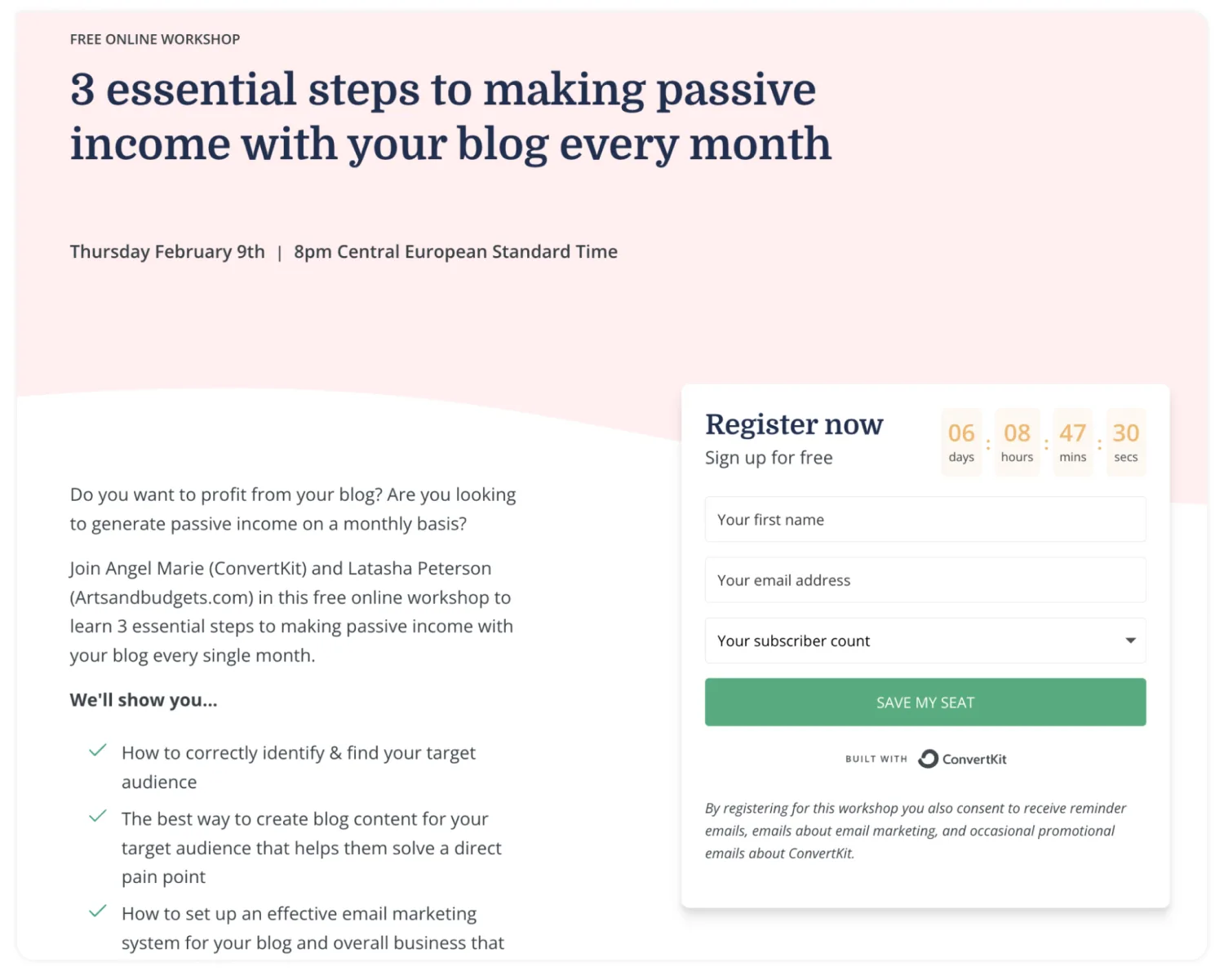
Kit’s pages for each live workshop feature a countdown timer next to the signup form. Image via Kit.
7. Have an FAQ section to tackle possible objections
When someone lands on your page, they don’t quite have the chance to ask you questions if they’re unsure that what you have to offer is the right option for them. That’s why a frequently asked question section comes in handy.
For example, you can use it to outline how long it will take to implement what you’re teaching, who the lead magnet is for, who it isn’t for, the format it’s in, and the content the subscriber will receive after they’ve finished implementing your lead magnet.
8. Optimize your landing page for search
Once you’ve built in all the key elements for your landing page to resonate with your target audience, consider your landing page SEO. Here are some questions to make sure it can do well in search results:
- Have you included relevant keywords, including variations of what your target subscriber types into search engines?
- Does the page have its dedicated meta title and description?
- Have you linked to your landing page from other relevant pages on your website?
- Have you structured your landing page copy with relevant subheaders?
- Does the page load quickly?
9. Feature a video
Your landing page and your email list are a brilliant way to start building a relationship with new subscribers. A great way to enhance that is by adding a video to your landing page that will let you show your face, voice, and teaching style to visitors who want to take that next step with you.
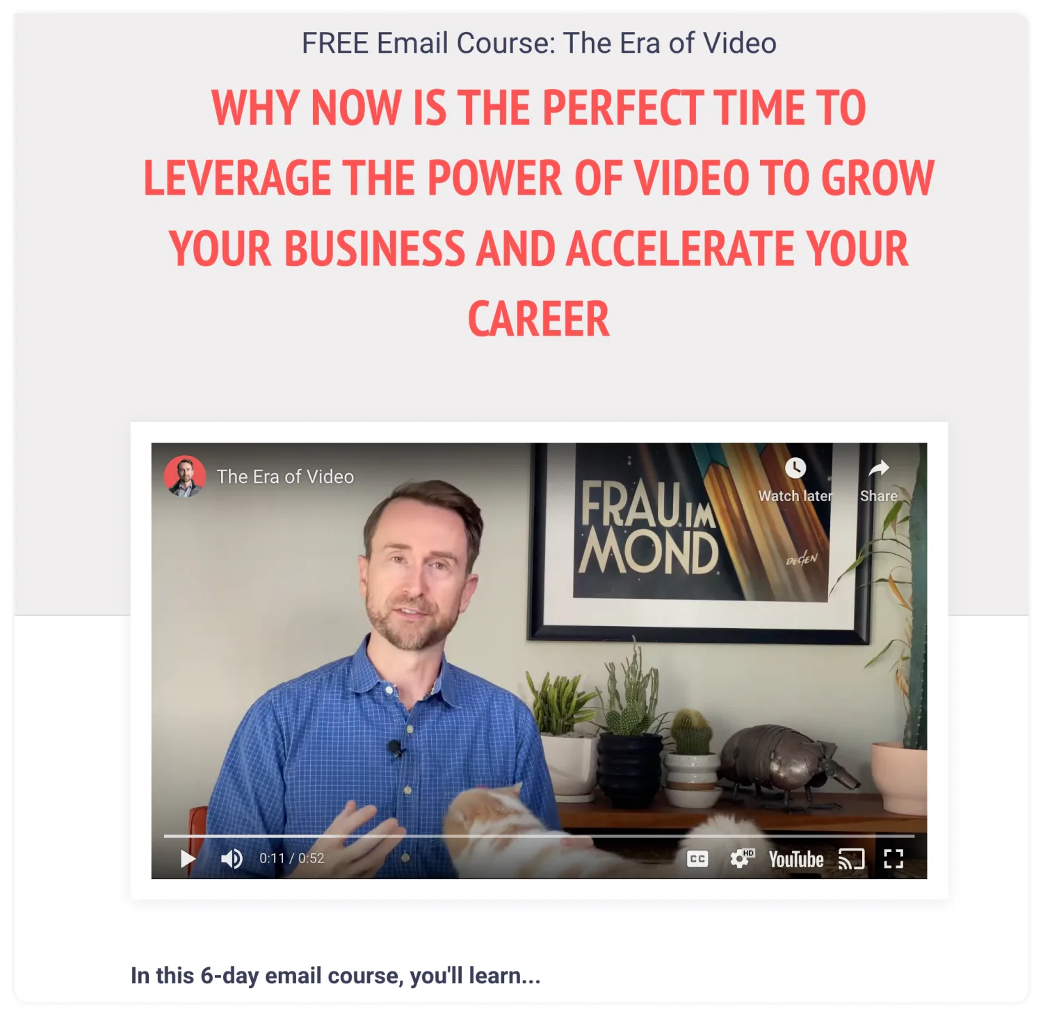
Embed a short video to introduce yourself and your thinking to potential subscribers. Image via Actionworks.
10. Lean into click triggers
Click triggers act as a final nudge to encourage your visitor to sign up for the offer in front of them—and eliminate any last doubts they may have.
Options you can use include a link to a privacy policy, the number of subscribers already on your list, a promise you’ll only send valuable emails and never spam, or a money-back guarantee if you’re talking about a paid offer or an upcoming launch.

“Join over 14,000 others” is an excellent click trigger. Image via Go Make Things.
Build a landing page that converts in just 10 minutes (with Kit)
If you want to get a head start on designing a landing page that brings tangible results, you’ll love Kit’s landing page builder and a library of templates you can use instead of starting from scratch.
Not just that: right inside Kit, you can instantly build a matching thank you page and a delightful sequence of emails to follow so you can turn your new subscribers into loyal fans.
It only takes minutes. Grab your free Kit account to bring your landing page to life.


