In this Article
Usually, when a company announces a new brand identity, they share their new logo immediately. But we’ve been doing things differently.
We’ve spent the last few months rebranding in public, getting feedback from creators like you on the new direction for our brand as Kit.
As Creative Director, it’s been an honor to have our brand strategy informed by conversations with creators about what they look for in a tool they trust to run their business, and I’ve enjoyed getting to discuss details of our visual brand identity with creators as I’ve asked for their feedback.
Today, I’m excited to finally reveal our new brand identity, including logo, font, and brand color, and discuss how your insights have shaped the future of Kit.
The strategy behind Kit’s brand
Our rebrand to Kit goes beyond aesthetics. It reflects the values we stand for and a bold new direction for how we serve the creator community.
Because what really drives creators isn’t just revenue—it’s passion, creativity, and a desire to connect with their audience.
Through conversations with creators, we learned that while earning a living is important, what creators value even more is the purpose behind their work—the “why” that keeps them going.
That’s why our brand strategy for Kit is centered on the idea that being a creator is about more than earning money. It’s the value you create in the world and the connection you build with the people who support you.
Kit is here to help you tap into that deeper level of meaning, giving you the tools and support you need to make your business not only profitable but truly purposeful.
The Kit product philosophy: a tool built for connection
At the heart of our brand strategy is the concept of a value exchange.
When you’re a creator, you’re not just putting content out into the world—you’re building real relationships with your audience. You offer them creativity, knowledge, and inspiration, and in return, they give you feedback, engagement, and, yes, income. But it’s the connection that makes it all worthwhile.
Kit’s product philosophy is about supporting that exchange.
We’ve designed the platform to help you build a business that’s as unique as your creative vision. It’s customizable, scalable, and, most importantly, focused on helping you grow in ways that matter.
Whether through our app store that lets you tailor your Kit or the Creator Network, where collaboration helps you reach new audiences, Kit is here to help you build something that reflects who you are and where you want to go.
Our principles for bringing the brand strategy to life
When you’re starting to craft a brand there are so many different decisions you could make. You really need some constraints to design and create within.
The brand strategy is one of those constraints. But to help narrow our focus even more, we decided on three tonal principles—ways we communicate who we are—to act as guardrails that keep our identity consistent across every touchpoint.
These principles guide not only how we communicate but also how we present ourselves visually.
- Bold: Kit is confident in its expertise and unafraid to stand out. We speak with authority, but we also embrace creativity and a bit of risk.
- Sincere: We deeply believe in creators and the work they do, which is why we make creators the heroes of our brand.
- Expert: With over a decade of experience in the creator economy and as the platform used by top creators, we know what it takes for creators to succeed. We use this knowledge to help you make your business more valuable.
We believe these tonal principles best fit how we want to show up for the creator community as Kit.
Choosing the right visual identity
Now let’s answer that question I know is on your mind—“How is it all going to look?”
Our bold new logo and what it represents
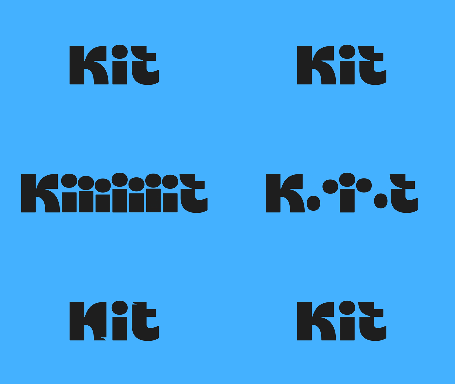
The new Kit logo is modern and clean, with small details designed to reflect Kit’s deeper purpose and connection to the creator community.
It’s bold. It’s confident—but it’s still friendly and approachable.
And it represents two core ideas.
- A value exchange: You might notice the small arrows hidden in the negative space between the K and T. These represent the exchange of value between creators and their audience—creativity and engagement flowing both ways.
- Creators are at the heart of everything we do: The lowercase “i” in the middle of our logo symbolizes the creator. It’s a subtle but meaningful reminder that Kit is here to serve you—the creator—putting your needs and vision at the center of our product.
Kit blue
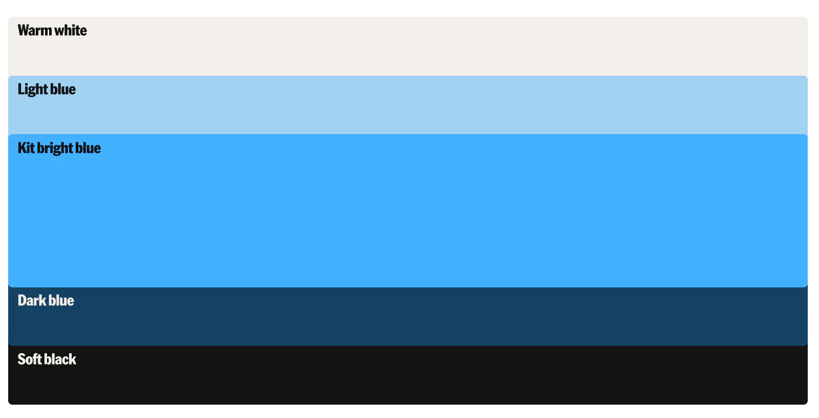
We needed something fresh and modern to reflect the evolving creator economy. We wanted a brand color that felt bold but still portrayed our expertise.
Blue is a very trustworthy, grounded color, but this shade of blue in particular, is still energizing and exciting.
It’s bold without being overbearing and speaks to the confidence we want creators to feel when they use Kit.
And do you wanna know something funny?
ConvertKit used to be a blue brand when we first started, so in a way, this change is a nod to our past while we enter a new era as Kit.
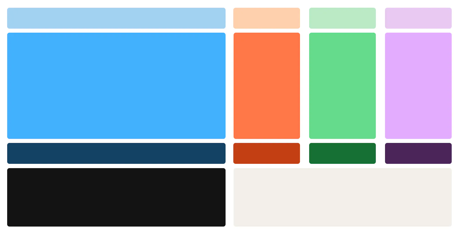
We’re pairing Kit blue with a set of bold secondary colors that will help us to keep our brand assets looking fresh.
Kit Sans
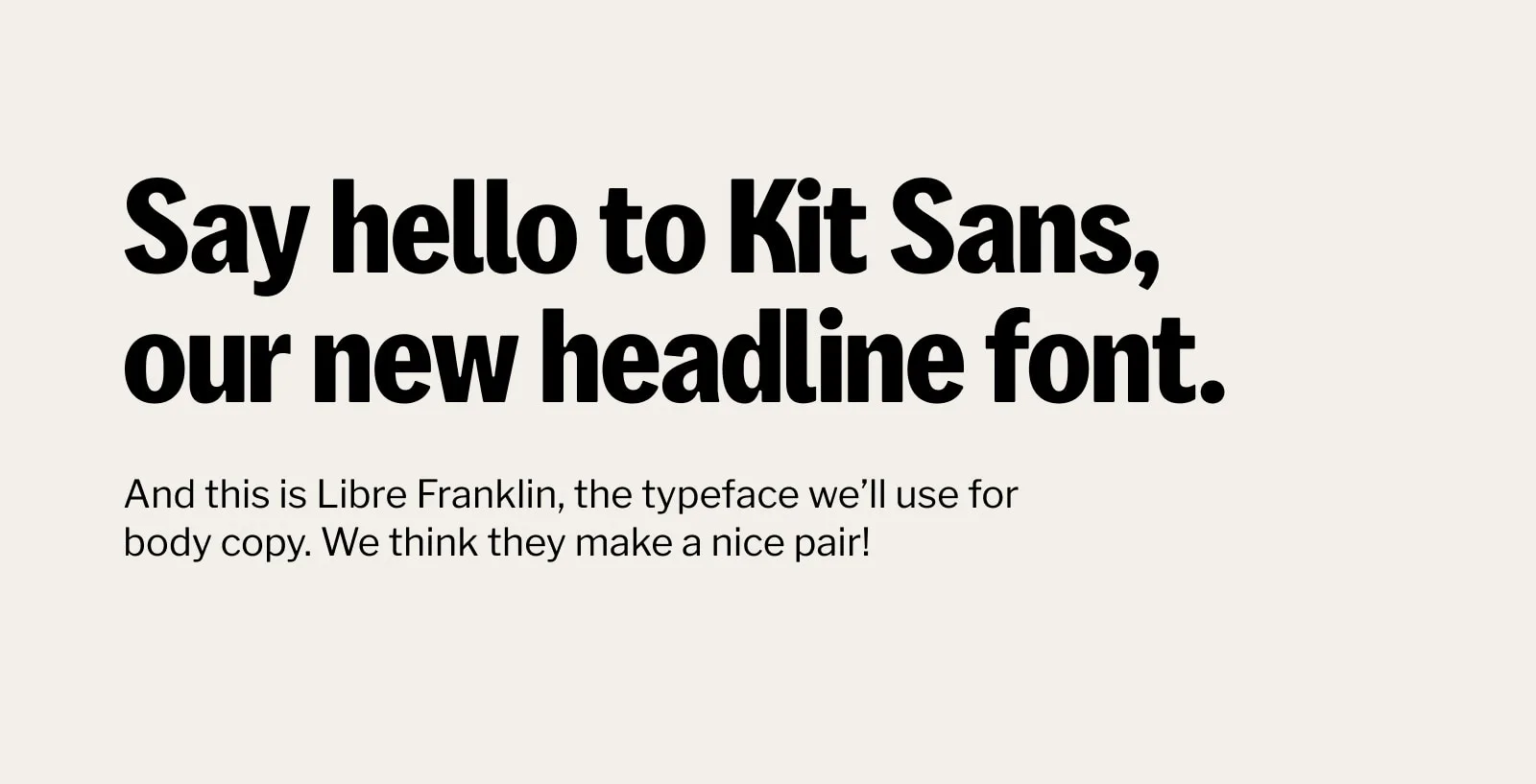
And then there’s our new font—Kit Sans.
It’s a custom font designed just for us and captures everything our brand stands for—boldness, sincerity, and expertise.
It’s sleek and professional but with a touch of warmth and personality in its curves. It’s designed to stand out in headlines and make a statement.
Paired with Libre Franklin for body text, Kit Sans brings a cohesive, polished look to our brand.
What this rebrand means for you, our creators
So, what does all this mean for you?
As we transition from ConvertKit to Kit, we’re not just changing our name—we’re evolving to better support you as a creator.
This rebrand is about making sure Kit gives you the tools and confidence you need to build a business that reflects your passion and purpose.
We know that creator businesses are serious businesses.
The outside world might look at what you do and think it’s “just” making videos or “just” recording podcasts—but we know better.
Your work is valuable and deserves a platform that takes you seriously. With Kit, we’re building an operating system that grows with you, helping you build the business of your dreams.
And this is just the beginning. As we begin rolling out Kit’s new identity, you’ll start seeing these changes come to life across our platform.
Everything from the app’s UI to our site and branding is designed to help you feel more confident, more connected, and ready to build a business that truly matters.
Check out Episode 3 of our Rebranding in public docuseries for a deeper look into the process that led to all these decisions.
Stay tuned for more updates as we keep building Kit into the platform creators can rely on for years to come.
