In this Article
You have a brilliant idea for an online course. You can outline it straight from your head and easily visualize people whose pain points you’re solving.
There’s just one problem: you have no clue where to start with your online course sales page.
The good news? We do, and after this article, you’ll know it too. Dive in to learn what makes an online course sales page successful, the sections you need to include, and fantastic sales page examples from creators just like you.
What is an online course sales page?
An online course sales page is a dedicated page that outlines every important detail of your course.
You might talk about your course elsewhere—in your newsletter, on your website, on social media—but your sales page is the ultimate place that answers every question someone can have about your course, all in one place.
It’s also where they can initiate and complete their purchase, after which they get access to your course.
Sales page vs. landing page for online courses: the difference
Your online course sales page can also be called an online course landing page, and in this case, these two terms are interchangeable.
A landing page is simply a standalone page with a focused call-to-action and encourages visitors to take that action. The sales page for your online course is therefore a type of a landing page.
In other words, every sales page is a landing page, but not every landing page is a sales page. That’s because landing pages can lead to actions that aren’t a transaction, like downloading a PDF, signing up to a waitlist, or joining a newsletter.
How to create a sales funnel for your online course
Your online course sales funnel can look something like this:
- People sign up to your email list through your teaching and a valuable resource, like a workbook related to a blog post they read on your website
- You send them an automated sequence of educational emails based on the topic they’ve signed up through, while also keeping track of the types of links (topics) they click on and interact with
- When a subscriber keeps on opening and interacting with your emails, and you build more trust with them, you start mentioning your online course
- After weeks of teaching through this sequence, you send an automated email that focuses solely on your course and its benefits, outcomes, and the challenges it solves
This is easy to do with Kit—check out our guide on connecting your sales funnel and your landing page to make it happen.
How to write a persuasive course landing page
Creators with the best course pages answer these three questions before writing a single word of sales page copy. Consider these questions and get as specific as you can when answering them:
Question #1: Who is your online course for?
Your online course solves a pain point. Who are your target students—the people that have this pain point regularly? How do they talk about themselves and the issue you’re solving? What have they tried before?
Question #2: What is the goal of your online course?
In other words, what is the ultimate accomplishment your target customer craves and hopes to achieve with a course like yours?
Question #3: What is the benefit of your online course?
This builds upon the answer from your previous question. Let’s say your target student’s goal is to learn how to budget and manage personal finances. What’s the broader effect of hitting that goal? How will it impact their life as a whole?
In the budgeting example, the answer might be “having the confidence to take care of their family and enjoy life more through travel and experiences they couldn’t budget for before.”
Anatomy of a sales page for online courses + a free sales page template
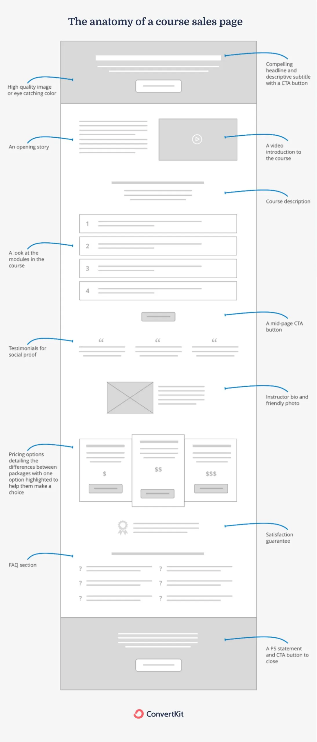
Here are the key building blocks you need on your online course sales page:
- Compelling headline and subtitle: the instant, quick, straightforward overview of what your course does
- High-quality visuals: header image, videos, charts, and mockups to show what your course includes, the results it created, and who it’s for
- Strong call-to-actions: buttons that drive the most important action on your page—starting and completing the course purchase
- Teacher’s bio and story: one or two sections that showcase why you’re the right person to learn from about that topic
- Result-focused course description: the details on what’s included and how the course is laid out
- Testimonials and social proof: the evidence your course created real results with real people
- FAQs: a section that has answers to all the questions someone may have before purchasing your course
- Pricing: the details about the cost of your course, as well as what’s included in different tiers if you offer them
- Satisfaction guarantee: a safety net in the form of a refund option that helps your audience make a decision risk-free
- A final summary: the very last section of your course page that brings everything together and has a final call-to-action
14 examples + tips to create an attractive landing page for your course
Let’s jump into 14 inspiring online course sales page examples.
Pssst: want to make your own course landing page but unsure where to start? Check out our guide on building a landing page —you don’t even need a website.
Example #1: A compelling headline
Your headline has a big task: convince your reader they’re in the right place and to keep reading so that the rest of your course sales page can do its job in a matter of seconds.
The best sales page headlines instantly appeal to the type of person your ideal customer is, the goal they want to achieve, and the pain point that’s keeping them from it.

The powerful headline on the course sales page for the Positioning That Sells course by Dan Kulkov. Image via MakerBox.
Headline tips:
- Get as specific as possible, so instead of “save time and money” for a meal-prepping course headline, you could write “save 8 hours and $200 per week”
- Reference a key challenge or a desired win; the MakerBox course above is a brilliant example as it mentions the pain point of being ignored by the target audience
- Write a lot of headlines; try writing 10, 20, or even 50 headlines for your sales page—it’s how you’ll iterate toward the best one
Example #2: A descriptive subtitle
The course subtitle gives the headline more context and is usually longer and more descriptive. It should be punchy and clear, emphasizing the biggest win your reader will get once they take the course.

Steph Taylor’s podcasting course promises no tech nightmares and the exact steps to make a podcast successful. Image via Steph Taylor.
Subtitle tips:
- Help your reader self-qualify; for example, Steph Taylor’s page emphasizes this course is for podcast newbies and not someone who already knows their way around podcasting tech and processes
- Give your reader a sense of ease and match the outcome with the feeling they’ll get by taking your course, like getting back control of their time, launching a product with success, and decorating a room with confidence
Example #3, #4, and #5: High-quality visuals
Your sales page visuals like images (header, mockups, charts) and videos help your future students visualize your course. There are a few ways to use them—see below for tips to get it right.

Header image on Katelyn Bourgoin and Demand Curve’s Un-ignorable course page (top left), mockup on Marie Poulin’s Notion Mastery page (top right), and charts and video on Jay Clouse’s course page for Build a Beloved Membership (bottom).
Header image tips:
- Use a header image that will grab attention but won’t distract from the headline, subtitle, call-to-action, and other important elements
- Your course page header image is a great opportunity to reinforce your branding like colors and icons
Mockup tips:
- Use mockups to help your future students visualize the journey ahead of them and the results they’ll get
- If you opt for different devices on your mockups, consider the devices your students will use (for example, on-the-go, busy moms are more likely to rely on their smartphone than a desktop computer)
- Tools like Canva have premade templates for mockups on different devices
Charts, graphs, and/or diagrams tips:
- Use charts, graphs, or diagrams to showcase results from the process you’re teaching—this can be your own or your past students’
- You can use direct screenshots (like Jay Clouse did with Stripe above) or create your own in Google Sheets or Canva
Video tips:
- Use video to give your page depth—it keeps visitors on your page for longer and gives them more information and context than a long text could
- In your videos, you can feature yourself as you talk about your experience and your course, or you can feature past students’ testimonials, showcase the inside of your course platform, and more
Example #6: Eye-catching CTA buttons
Call-to-action (CTA) buttons drive the most important activity on the sales page for your online course. They need to be clear, enticing, and ideally appear multiple times throughout the page, as landing pages for online courses tend to be longer.

One of the sections with an enticing CTA on the course page for Bookkeeping It Real online course. Image via Straight Up Bookkeeping.
Call-to-action tips:
- Make sure all of your CTA buttons lead to the same point—the checkout process for your course
- Keep the copy straightforward, but feel free to use it to get your reader excited; “I’m in!” or “I’m ready to get started” are more enticing than “Buy” or “Start”
Example #7: Relatable opening story
Stories are what gets us involved and engaged. They help us relate and make us feel like we belong.
A story on your course sales page can focus on where you started, how you made your way to where you are today, and how you can help someone who feels the way you did in the beginning. This type of story will hook your ideal customer and encourage them to keep reading about your course.
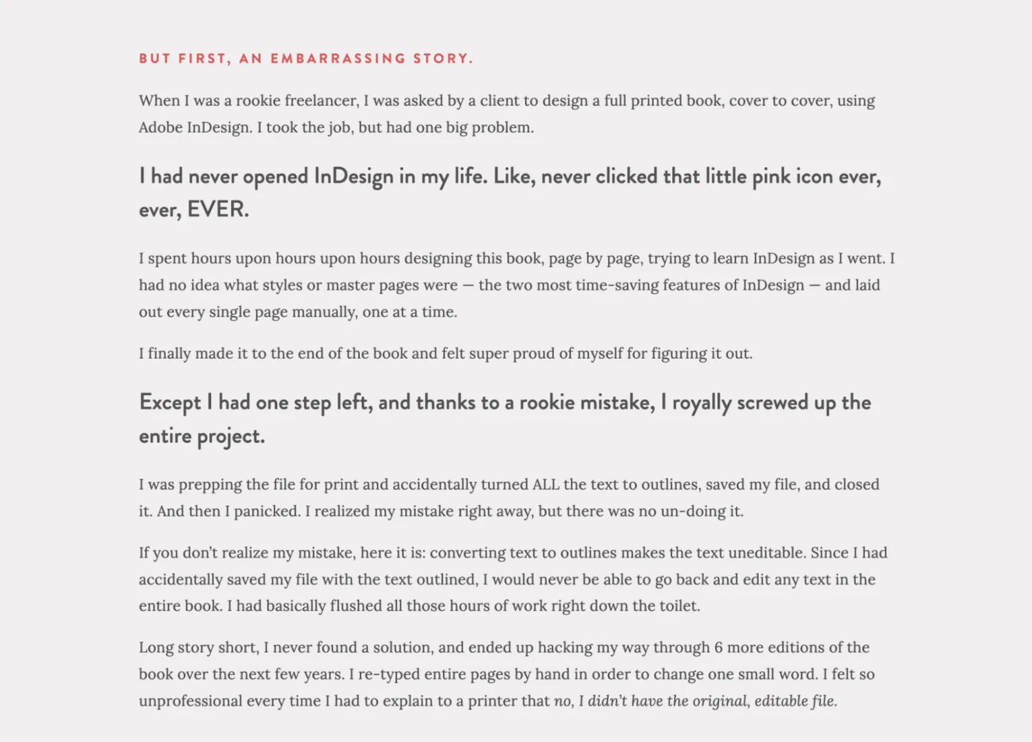
Kelsey Baldwin, the creator and designer behind Paper & Oats, tells a powerful story on her online course sales page focused on In Design. Image via The InDesign Field Guide.
Story tips:
- Tell an original story from your journey that the majority of your ideal students can relate to
- Include rich details that make your story unique, but pay attention to your story length—you don’t want to lose your reader halfway
- Use formatting to make the story easy to scan through, like bullet points and subheadings
Example #8: Result-focused course description
The job of your course description is to expand on who the course is for, its benefits, outcomes, and contents—lessons, workbooks, and other course materials.
Ideally, it’s what will make your course page visitor feel understood and get them to nod their head yes as they progress down the page.
Course description tips:
- Be straightforward about who your course is for. “This course is for creators who want to get brands to pay them” is a lot clearer than, say, “Make money online”
- Use subheadings and sections to lay out the structure of your course
- If it fits, include a response to the most likely objection a visitor may have; in Justin Moore’s case above, it’s “Even if you have less than 10,000 followers, are a brand-new influencer, and don’t know where to begin”
Example #9: Testimonials, social proof, and case studies
The proof that your course has impacted others is one of the most powerful tools to convert a somewhat interested visitor into an “I need this now!” fan.
Many of their objections before buying can be summed up as: “But will this work for me?”
Testimonials and case studies from previous students, along with social proof like tweets and other social media posts, answer that question for them.

Written and video testimonials on Corey Wilks’ page for the Intentional Life Design course. Image via Corey Wilks.
Testimonial tips:
- Testimonials can be both about your course, as well as you as the expert teaching it—if you have both, feel free to include them where it makes sense
- If a testimonial is very long, format it in a way that’s easy to scan, remove sentences that dilute the message (ask for permission from the person that gave the testimonial), and bold the key parts
Case study tips:
- Divide your case study into three parts: the before (the pain point), the action (taking your course), and the after (the results)
- A case study on your course landing page can be a section with three paragraphs, or a video
Social proof tips:
- Look through your Instagram comments and messages, X/Twitter mentions, Facebook comments, emails from subscribers etc. to find and screenshot genuine, candid praise about your course and/or your work in general
- Use these in a specific section on your sales page or sprinkled throughout the page where they fit
Example #10: Reassuring instructor bio
“What gives you the foundation to make your claims and promises?”
That’s another key question your course page visitors need an answer to before they make a final decision to join your course. Your instructor bio gives you the space to highlight your years of experience, results you’ve created, and challenges you’ve solved—and build trust with potential students.

Jeremy Enns’ bio on his Podcast Marketing Academy course page, cleverly paired up with a testimonial about his expertise and field of knowledge. Image via Podcast Marketing Academy.
Bio tips:
- Keep your bio relatively short—a couple of well thought-out paragraphs will do the job well
- Your full bio might be long and impressive but emphasize a few key points that will present you as a pro in your niche and keep the rest out
- Pair your bio with your headshot so people can connect with you better
Example #11: Answer all their questions with an FAQ section
Ideally, your headline, subtitle, story, course description, and testimonials should answer all the questions someone has as they read through the landing page for your online course.
But a section with frequently asked questions can do two things really well: tackle any questions that didn’t fit elsewhere on the page and showcase that you thought of everything when building your course—which is another trust builder.

The FAQ section on the Lavendaire’s Create Your Dream Life course page. Image via Lavendaire.
FAQ tips:
- Cover key areas like start date, course length and format, type of support you offer, and refund policy in your FAQs, even if you mentioned all of this elsewhere on the page
- Include questions you’ve regularly heard from people that considered taking your course
- Place your FAQ section lower on your course sales page
Example #12: Straightforward pricing details
In your pricing, be precise about what a student gets by buying your online course—like the lessons, level of access to you, bonus materials—and do the same for different pricing tiers and plans if you offer them.
As they look at pricing, readers are probably in the highest state of interest and weighing their options. Use this as another opportunity to emphasize the benefits and outcomes of your course to them.

The pricing details for the figure drawing masterclass by Chris Legaspi. Image via Draw With Chris.
Pricing tips:
- If you have multiple options, present your pricing as bullet points that highlight key tiers and prices, or as a table that puts them side by side
- For longer course sales pages, feature pricing in multiple places
Example #13: Satisfaction guarantee
A satisfaction guarantee means you’re giving your students an option to pull out of the course for a full refund in case they aren’t happy with it.
Some creators offer a refund in exchange for proof that the course didn’t give the student the outcome they wanted—for example, a filled-out workbook. Others issue a refund, no questions asked.
If you choose to offer refunds as a satisfaction guarantee, how you’ll do it is entirely up to you.

The money back guarantee on the course sales page for Melyssa Griffin’s Email List Academy course. Image via Email List Academy.
Money back tips:
- Choose the time period for your guarantee and its structure (no questions asked vs. conditions that apply)
- Research your niche to understand what’s the standard for your type of course and price range
- Survey your audience (e.g. in an email, on social media) and ask how a satisfaction guarantee would affect their decision-making process
Example #14: Include a P.S.
Some people will quickly scroll down your course landing page and look for the “too long, didn’t read” summary of your page.
Instead of including one final, lone “Buy now” button at the bottom of your page, use this space to reiterate and summarize the main message and the value of your course.

The final section of the course page for Sarah Greesonbach’s course, The B2B Writing Seminar. Image via B2B Writing Institute.
Final summary tips:
- For your P.S. section, you can use a structured list or write 1-2 clear, impactful paragraphs
- Reinforce the outcome and any bonuses that will help your student reach their goal
- Make the CTA button unmissable in this section
3 more landing pages examples you can use to increase your online course sales
As you build your sales funnel and your strategy to sell more courses in the future, you may want to consider these three additional landing page options.
Example #15: Teach a webinar as part of your launch strategy
Teaching a webinar is a great way to give value to potential customers, showcase your teaching style, and build lasting trust with your audience.
Not just that: you can turn a live webinar recording into an evergreen resource that can grow your email list and sell your course on autopilot. It’s what makes it worth learning how to build a great webinar landing page.
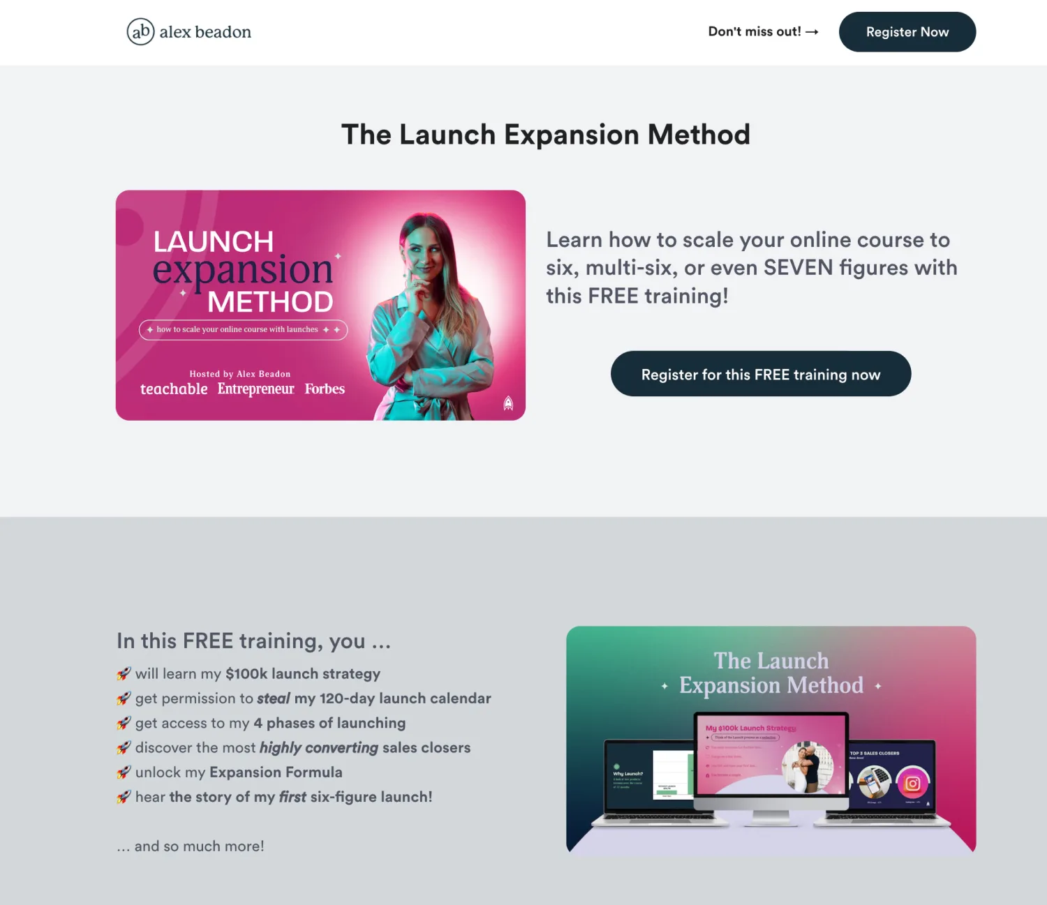
Alex Beadon, a launch strategist, offers her Launch Expansion Method webinar as a promotion for and an introduction to her signature program, Together We Launch. Image via Alex Beadon.
Example #16: Increase curiosity with a coming soon page
You don’t need to wait for your course to be finished and ready to launch to start teasing it for your audience.
A coming soon landing page is a fantastic way to gauge interest, spark curiosity, gain feedback, and warm up your audience for a fantastic course coming their way.
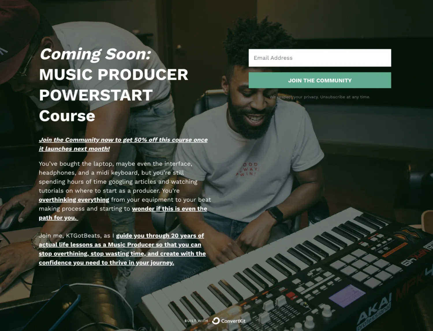
A coming soon landing page example for a music production course, along with a discount once the launch is live. Image via KTGotBeats.
Example #17: Use a thank you page to share what’s next and decrease refund requests
Thank you pages show up at the highest point of excitement for your students—right after they purchased something they believe will make their life better.
- Some examples of information you can share:
- Next steps (like logging in, setting a password, bookmarking the course page)
- The schedule for upcoming emails
- The link to a login page and/or a page with all the details they need to navigate the course
- Schedule for office hours or live teaching if you offer it
- Directions for getting support or sharing feedback
Launch an online course sales page that brings you long-term success
You have a list of things you need to launch and succeed with your online course—all the sales page elements; the sales funnel that will help you sell your course; the examples to inspire you.
The final piece you need for that puzzle? A powerful tool that will help you grow your online audience, send them the right email at the right time, and nurture them for years to come—without adding endless tasks to your plate.
That tool is Kit. If you don’t have it yet, create your account here and to see all the opportunities to run a thriving online course business.


