In this Article
A sales page is the only thing standing between you and your potential customers, and it’s either pulling people in or scaring them away.
Your business depends on customers making a purchase, but luckily, creating a sales page that converts is easier than you might think.
What is a sales page?
A sales page is a standalone webpage with only one goal: to encourage visitors to buy what you’re selling.
What is the difference between a sales page and a landing page?
There are plenty of different types of landing pages—like lead gen pages and click-through pages—and sales pages just happen to be a type of landing page. In other words, all sales pages are landing pages, but not all landing pages are sales pages.
What’s the difference between a sales page and a homepage?
Sales pages also differ from your website’s homepage. Typically, your homepage includes links to important info like contact info, latest blog posts, and all your offers. In contrast, a sales page has information for one offer.
8 steps to create a sales page + inspirational examples
Now let’s get into the good part: how to create a sales page that converts. You can create a sales page in eight easy steps:
- Get to know your audience
- Create a value proposition for your offer
- Set your pricing
- Determine your sales page length
- Write captivating copy
- Design your sales page (+ free template)
- Add your CTA
- Bonus: Automate your sales funnel
Let’s flesh out each step and dive into relevant sales page examples. After reading, you’ll know exactly what’s needed for each element of the sales page.
Step #1 – Get to know your audience
You can’t sell your product if you don’t know who you’re selling to.
If you’ve never researched your target customer, figure out who they are, what they like, and most importantly, what problems your offer solves for them.
What Kiffanie Stahle did well

Legal coach Kiffanie Stahle took the time to speak with her ideal audience before creating her landing page to nail her messaging. She tells me:
When I was designing the sales page, I put a call out in my Kit newsletter for free 15-minute calls with me where I’d answer one of their legal questions in exchange for a few questions of my own. And one of the questions I asked was “What’s the biggest roadblock in your creative business when it comes to the legal side?
I took the most common themes in their answers and put a positive spin on them to come up with the four bullet points above.” – Kiffanie Stahle
Book calls with your subscribers, like Kiffanie, or survey your list with tags to get valuable insight.
Step #2 – Create a value proposition for your offer
Think of the value proposition as your elevator pitch: How do you succinctly describe what you are selling?
Here’s an easy formula to follow if you’re stuck:

And here’s the above formula in action:
My WEDDING CAKE COURSE helps ASPIRING PASTRY CHEFS to LEARN THE BASICS OF DECORATING WEDDING CAKES by TEACHING HOW THE PROS USE EDIBLE AND NON-EDIBLE DECORATIONS.
Having this statement is your north star as you write your sales page. When you have a question or are confused about whether your copy aligns with your mission, check back with your value proposition.
What Kailee Wright did well
While you don’t need to explicitly include your value proposition in your sales page copy, home organizer Kailee Wright did. Her value proposition (“a digital course to help you make your home look like it was organized professionally for a fraction of the cost”) makes it crystal clear what she’s selling so potential customers have no doubts about what they’re buying.
Step #3 – Set your pricing
Nailing pricing is finicky business. Charge too much and you risk losing out on sales, but charge too little and your audience might not associate your product with quality and choose not to buy.
Pricing your products takes us back to step one: Knowing your audience. What do they historically purchase? What are they currently looking for? Are they beginners or advanced? Answering these questions can help you pick the perfect price.
What Fly Higher Flight Collective did well
If you’re unsure how to price your product, take a page from Rachel Estapa and experiment with pay-what-you-want pricing.
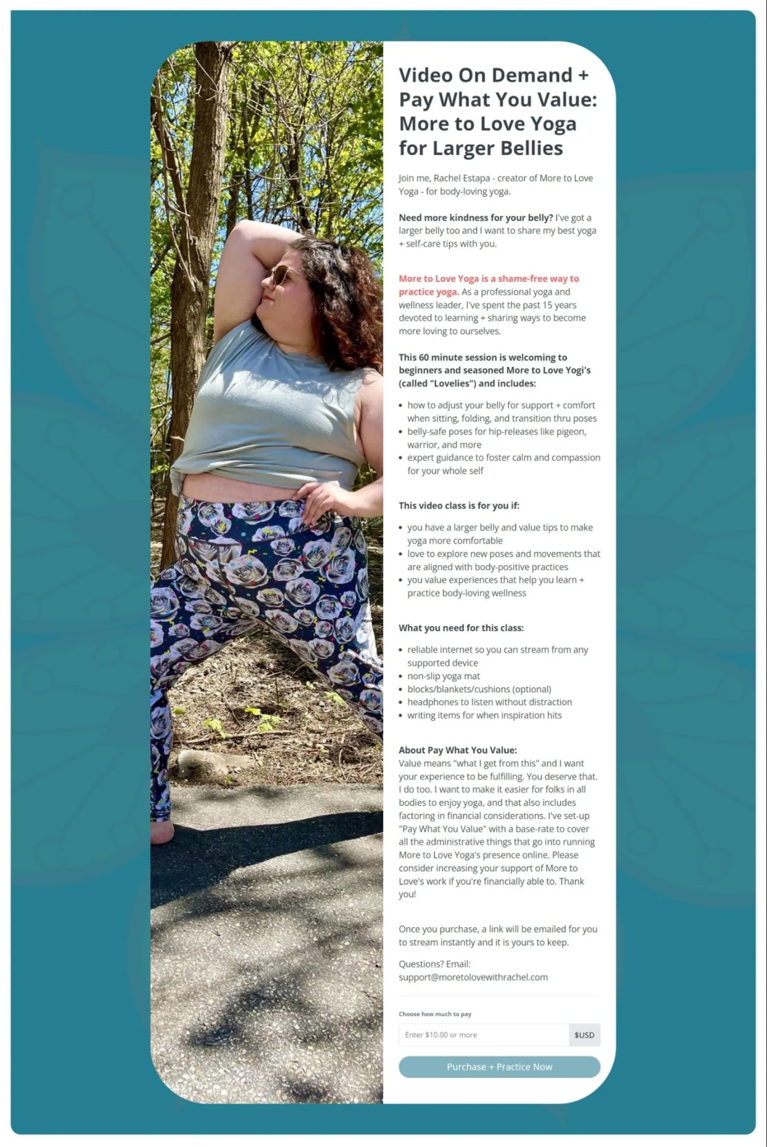
Image via More to Love
Or do what Fly Higher Flight Collective does and give your audience a choice between two different payment plans.
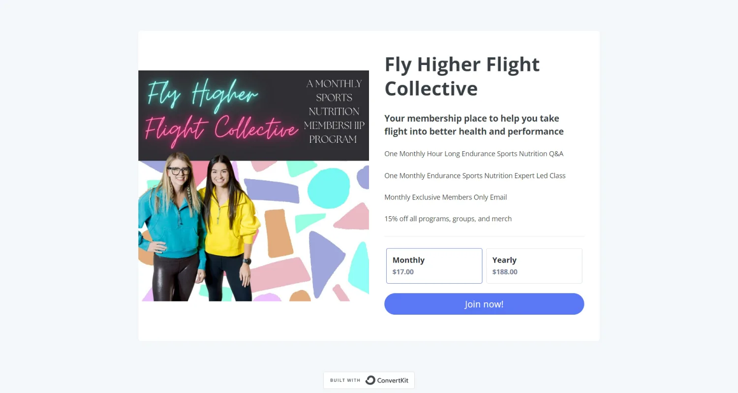
Image via Fly Higher Flight Collective
Ultimately, your pricing strategy depends on your audience and product.
Step #4 – Determine your sales page length
There’s no wrong answer to the question, “should my sales page be long or short?” But here are some ways to determine which length is best for you.
When to choose a long sales page
Choose a long sales page when:
- You need to go in-depth to explain your product
- You have plenty of customer objections to address
- You have a valuable—and relevant—story to tell
- You need time to dig into your audience’s pain point
Here’s a snippet of The Virtual Savvy’s 1,500-word sales page. Notice how you can still skim the page without reading each and every word? Break up long sales pages with headers, images, and lists—your potential buyers will thank you.
When to choose a short sales page
Choose a short sales page when:
- Short-form content performs better with your audience
- Your offer is clear, straightforward, and easy to understand
- Social media strategist Vera Jean’s sales page is easy to digest and lets you know what you’ll get without needing to scroll.
Step #5 – Write captivating sales page copy
Headline copy
Your headline should make your reader stop and think, “hey, I might be interested in this. Let me learn more.” Here are a few tips for writing your best sales page headlines:
Tip #1: Keep it short
Your headline should be quick and to the point. You can use your subhead and eyebrow text to go into more detail if needed.
Tip #2: Write plenty of versions
Try to write 25-30 variations. That may seem like a lot, but your headings will improve as you write and tweak. Even better, after you choose a winning headline from your list, you’ll have over 20 other one-liners you can plug into your landing page.
What Tarzan Kay did well
Copywriter Tarzan’s header has three components: eyebrow text, the header, and the subhead. All three work together to call out her ideal audience, their pain points, and her solution.
Body copy
Your body copy makes up the bulk of your sales page and paints a vivid picture of your offer for your reader.
Tip #1: Focus on benefits over features
While the details of your product are important to spell out, they’re not what sells your product. What sells are the benefits your client will experience because of your product.
For example, let’s say you’re selling an online course about budgeting. Your sales page can say that your program includes three modules with videos, worksheets, and a quiz, but that info isn’t exciting or attention-grabbing, right?
But when you talk about how the students of your course have saved up for vacations with their family or cut their debt down to $0 in just a year, potential customers will be much more inclined to keep reading and eventually buy your offer.
Tip #2: Write like you’re speaking to a friend
Think about a friend you have and write your sales page like you’re talking to that friend.
Don’t be dramatic, salesy, formal, or impersonal. Be empathic, talk to them directly (i.e., say “you”, and “your”), and tell stories. The more you can make your readers feel comfortable with you, the faster they will trust what you say.
Tip #3: Make it scannable
Your reader shouldn’t feel like they’re reading a textbook when they land on your sales page.
Most people who look at your sales page want to skim over the content quickly to see if it’s something they’d be interested in.
Here’s a quick list of ways to make your sales page copy scannable:
- Incorporate lists with bullet points
- Keep paragraphs under four lines.
- Add in subheadings for every two to three paragraphs
- Add in quotes from happy customers
What Yasmine Lesire did well
French instructor Yasime’s sales page is broken up with bullet points, complementary imagery, quotes, and headings to make it easy to digest.
Step #6 – Grab our sales page template and use it to create a thoughtful design
To speed up the process, we put together a free sales page template. Use it to dissect the anatomy of a great sales page and mock up your next design.
Great sales page design is all about building trust and guiding your reader to the CTA. The basic design elements of a sales page typically include:
- Header section
- High-quality visuals
- Body copy
- Social proof
- FAQs
- Pricing details
- CTA
- Guarantee
Here’s how to take the above elements and weave them together in a thoughtful way.
Header section
Your header is where you can put a hero image and a strong, compelling headline and a subheader.
High-quality visuals
Plenty of visuals can aid your landing page like:
- Hero images
- Mockups (like laptop and phone screens)
- Videos
- Charts and graphs
- Background images
Body copy
This is the description of your offer. Talk about how it will solve your audience’s problems and make life easier for them.
Social proof, testimonials, or case studies
Sprinkle social proof, reviews, or case studies throughout to increase your credibility with potential customers.
FAQ section
Don’t let any skepticism sit around your audience’s mind. Tackle any questions and objections you foresee them having while scrolling your sales page.
Tip: Instead of guessing objections, use email automations to follow up with people who don’t purchase your product with a quick survey. See what blocked them from buying, and use that information to address objectives and FAQs right on your sales page.
Pricing details
Clearly state pricing details on your sales page. No one wants to buy something before they know how it will affect their bank account.
Call to action (CTA) buttons
CTAs need to be prominent on your sales page. After all, the main point of the sales page is to get your reader to click the CTA buttons.
Guarantee
Check local laws to know if you have to include a refund period or guarantee for your offer. If yes, add it to your sales page.
What Mako did well
What stands out on artist Mako’s sales page is the collage of reviews followed up by a strong money-back guarantee.
Step 7: Have ONE Call to Action (CTA)
Whether it’s purchasing a new product, signing up for your online course, or buying your eBook, you want your audience to do something at the end of reading your sales page.
To help you reach that goal, you need to keep your call to action clear, simple, and direct.
Here are a few ways to have a solid CTA for your sales page:
Tip #1: Have a noticeable CTA button
Make your CTA pop with contrasting colors to keep it from blending into the rest of your sales page.
Tip #2: Use the call-to-action button multiple times
Put your beautiful CTA button at the top, the middle, and the bottom of your sales page to give your readers as many chances as possible to sign up for your offer.
What New Wave Knitting did well
New Wave Knitting’s CTA is clear, easy to spot, and appears multiple times throughout the sales page. This consistency and simplicity ensure readers don’t get overwhelmed or confused.
Step 8: Automate your sales funnel
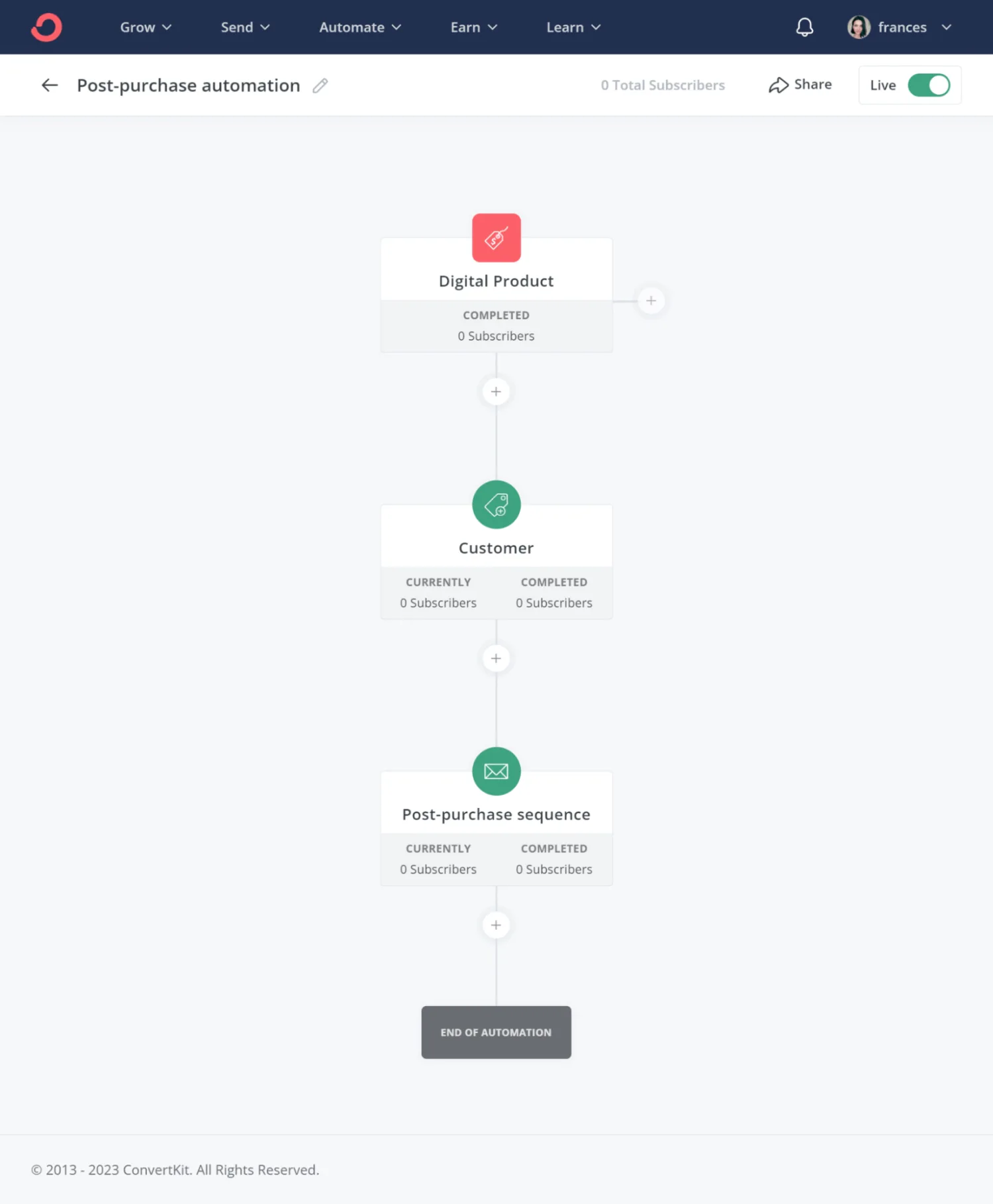
Make it easy for potential customers to pay you and get access to whatever they’ve purchased by setting up automations. Afterward, nurture them with your post-sales email automation sequence, like this one:
Grab the free post-purchase automation
This will assure them that they’ve made the right decisions to buy from you and decrease the likelihood of refund requests. At Kit, we offer intuitive and visual email automation funnels that allow you to build a 100% customizable post-sale care scenario.
More ideas to help you build an outstanding sales page
Here’s a few extra best practices for building a great sales page.
Remove links
You don’t want to send your reader anywhere off your sales page, so remove links that lead to other places like your about page or your contact page. If you feel certain information is necessary (like a bio about yourself), include it directly on the page instead of making visitors click away.
Only use one sales landing page per product or service
It might seem tempting to pitch all your products at once, but your sales page should only focus on one offer. Since creating sales pages with Kit is hassle-free, you can always set up multiple sales pages for each product you sell.
Mix it up
Our brains pay attention to patterns and ignore repetition, so mix up the elements on your sales page to keep readers on their toes. Here are some super simple ways to do this:
- Alternate images with text
- Add in subheads
- Don’t be afraid of white space
- Add background color to blocks of copy
- Use bullet points
Add a countdown timer to create urgency
Adding elements of urgency to your landing page can increase conversions (as long as they’re true). Some ideas:
- Add a countdown timer so people know when you’re closing the cart
- Include how many spots you have available
- Offer limited-time discounts
- Give bonuses to the first group of buyers
Keep testing and improving
The best landing pages are tweaked, tested, and refined over time. Perform tests on your landing page by trying out new bits of copy, imagery, or layouts to see which brings the most conversions. Just make sure to only test one change at time. Otherwise, you can’t pinpoint which change results in an increase—or decrease—in conversions.
Make your next sales page with Kit
Now that you have all the steps to create a sales landing page, it’s time to put them to practice!
Use the sales page examples throughout this guide to inspire your next creation, and sign up with Kit (for free!) to build your next high-converting landing page.
![8 steps for crafting a high converting sales page [template included]](https://media.kit.com/post/HERO-high-converting-sales-page.jpg?fm=webp&q=50&auto=format)


